Table of Contents
Anatomy of High-Converting Landing Pages: Design Principles That Scale
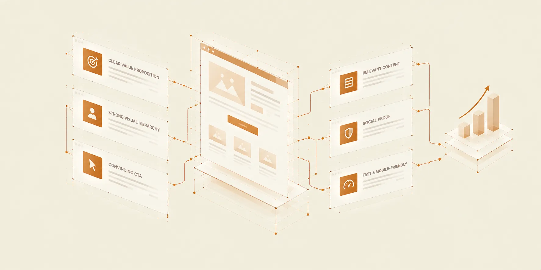
A driving force behind successful digital marketing campaigns is a dedicated, laser-focused landing page. While a general website serves as an expansive digital hub, a landing page has one singular job: guiding a specific audience toward taking one specific action. Yet, many organizations make the critical mistake of driving paid or organic traffic to crowded, multi-purpose pages that overwhelm users with choices.
High-converting landing pages aren’t created by luck; they are meticulously engineered using strategic visual hierarchy, psychological clarity, and high-performance technical foundations.
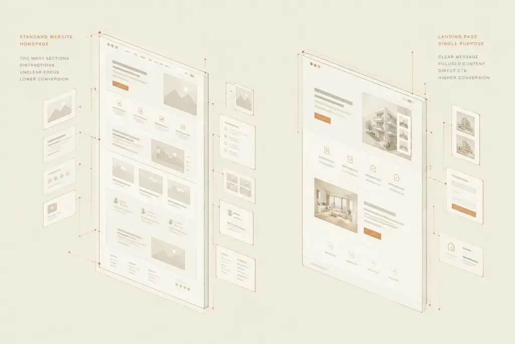
01 — Why Standard Web Pages Fail as Campaign Destinations
Directing ad traffic or promotional campaigns to generic website pages leads to immediate ad-spend leakage.
- Analysis Paralysis from Excessive Navigation: Standard pages contain global navigation menus, footer links, and secondary offers that distract users from the primary goal.
- Mismatched Message Match: If the headline on your landing page doesn’t directly reflect the exact promise made in your ad creative, visitors experience cognitive dissonance and leave instantly.
- Unfocused Content Flow: Mixing multiple calls to action (CTAs) dilutes user intent and drastically lowers overall conversion rates.
“Clarity always beats cleverness. A landing page should eliminate every unnecessary choice until the path forward is completely effortless.”
02 — Core Architectural Layers of a High-Converting Page
Every landing page that converts at scale relies on a proven visual and psychological blueprint.
1. The Above-the-Fold Value Anchor
The top section must immediately answer three core questions in under three seconds: What is the offer? Who is it for? What is the immediate benefit? A strong headline, supporting sub-headline, clear visual asset, and prominent CTA must work together seamlessly.
2. Frictionless Social Proof Integration
Trust must be established early. Position logos, brief client metrics, or contextual quotes right beneath the main hero section to reassure users that your brand is vetted and reliable.
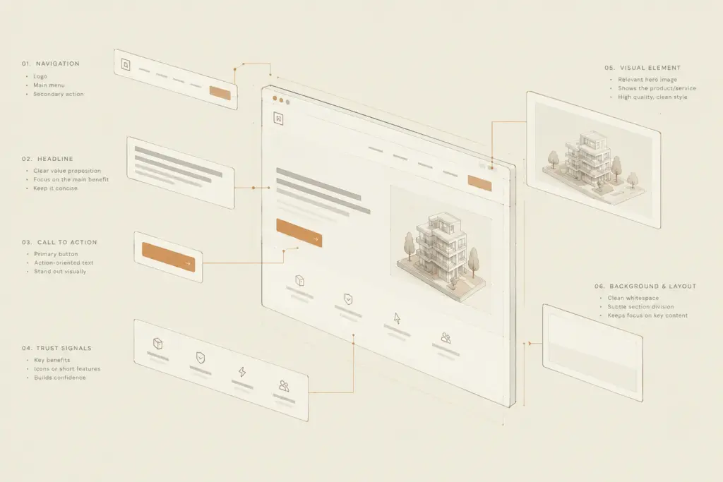
3. Structured Benefit Modules
Instead of walls of copy, group key features into scannable visual cards or minimalist list structures. Focus on outcomes rather than isolated technical specifications.
03 — Technical & Interaction Principles That Drive Completion
Visual presentation sets the stage, but smooth technical execution closes the deal.
- Sub-Second Page Load Speeds: Compress all media assets, eliminate blocking JavaScript, and pre-render content so the page loads instantly on mobile devices.
- Micro-Form Design: Reduce form fields to the absolute minimum required to qualify the lead. Implement progressive disclosure if collecting multi-step information.
- Sticky & Contextual CTAs: Keep the primary action visible as users scroll, ensuring they never have to search for the next step when decision-making peaks.
04 — Scaling Landing Page Testing for Sustainable Growth
Building a high-converting page is an iterative process. By establishing a modular component architecture, marketing and design teams can easily deploy A/B tests—swapping headlines,
Engineer Campaign Destinations That Convert
Stop leaking ad spend on distracted visitors. Build laser-focused landing pages engineered for maximum visual hierarchy, speed, and conversion velocity.